
(go to Abbey Pages Home)
(go to Monastic Pages Home)
(go to Historyfish Home)
Leave a Comment
|
<<Back
to Parts of a Monastery. (go to Abbey Pages Home) (go to Monastic Pages Home) (go to Historyfish Home) Leave a Comment |
 |
 Baptismal Fonts in the Medieval Church
| Baptism
was (is) the
sacrament that brought the fresh initiate into the bosom of
Christendom and made him/her one of the church community. As
such, baptismal fonts were, obviously, as vital a part of the church as
were the
shrines and chapels. In the book English Church Furniture, J. Charles Cox and Alfred Harvey did a survey of church fonts from the Saxon, Norman, and Early English eras. To offer you a glimpse as what these old fonts looked like, I've excerpted photographs and information from their work. Return to parts of the abbey church, see Parts of the Church. Return to parts of a medieval monastery, see Parts of a Monastery. For more about monks and nuns, see my monastics pages. |
|
Images below come from English Church Furniture by
J. Charles Cox and Alfred Harvey,
Published by Methuen & Co., 36 Essex Street, W.C. London, 1907. |
|
|
 |
Cox and Harvey
categorize the fonts they encounter as coming from three particular
eras, the Saxon era (after the Romans but before the Conquest of 1066),
the Norman era (which seems to be from 1066 sort of though the
reformation),
and 'early English' (by which I believe they mean post-reformation, or
even post- Elizabethan). Of the fonts
mentioned, the lion's share are put into their 'Norman' category.
But fewer remain in either the Saxon or Norman category than
should. The puritanical zeal of the Reformation caused
many medieval church
fonts to be lost, defaced or destroyed. Whatever could not be
melted down or sold to enrich Henry VIII and his "visitors" was treated
with callous distain. Reformer fundamentalists forbid the use of
the
beautiful fonts— many
of which were subsequently destroyed—and
demanded that a simple basin be used instead. |
| |
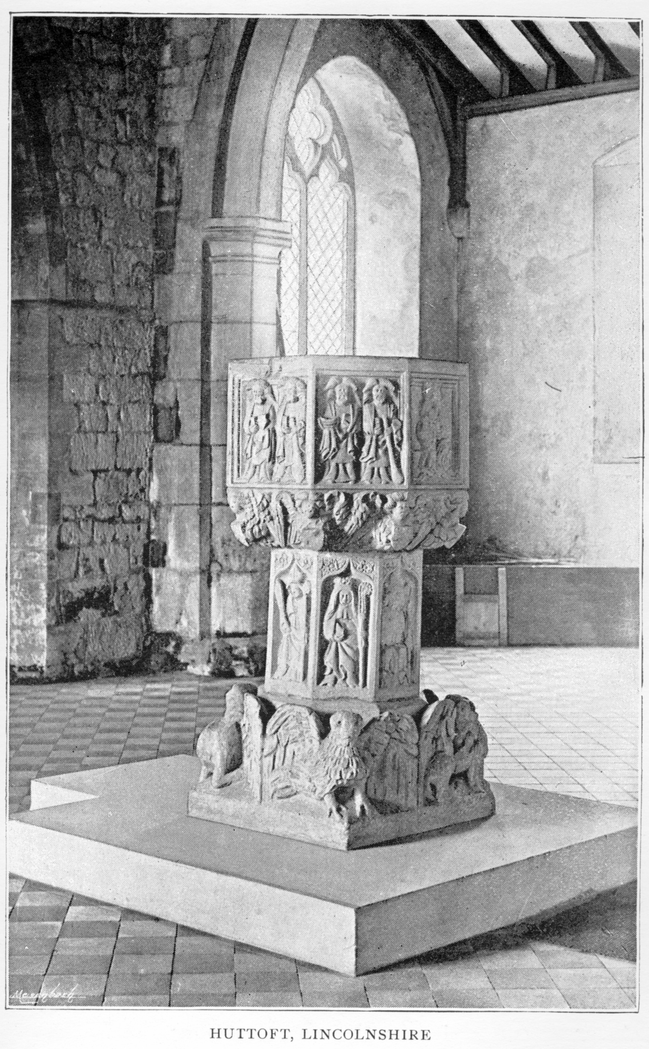
 A Norman font from Huttoft, Lincolnshire that escaped destruction during the reformation. Animals representing the four apostles are carved into the pedestal base, and in each of eight panels in its octagonal shape there are images that represent religious scenes. [Photo from Lincoln and Notts. Archaeological Society. Cox and Harvey, facing page 208.] [Download 2,284KB JPG of this image.] |
|
|
"In two cases the pre-Norman characters used in font inscriptions prove their Saxon date. The inscription on the circular font of Little Billing, Northants, engraved by Paley, runs round about a third of the circumference of the bowl, with two horizontal lines of Anglo-Saxon lettering ; it reads as follows :— Wigberhtus artifex
atque cementarius hunc fabricavit, Wigbert the artificer and mason made this (font), |
||
| |
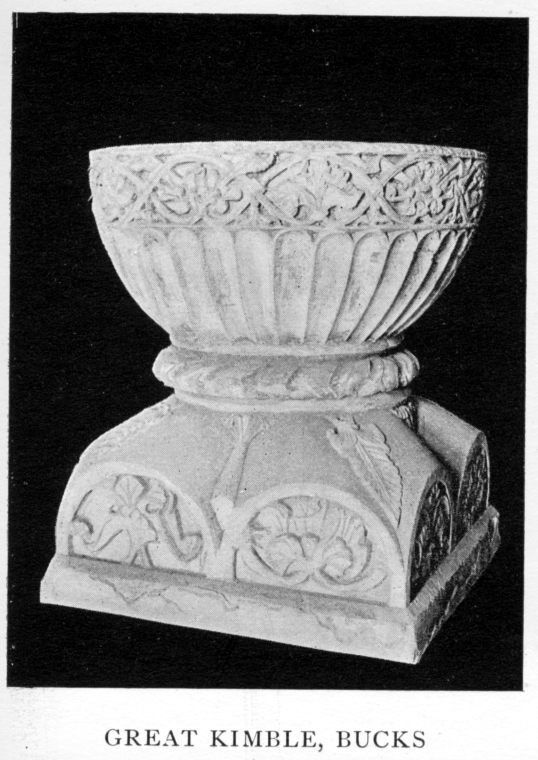
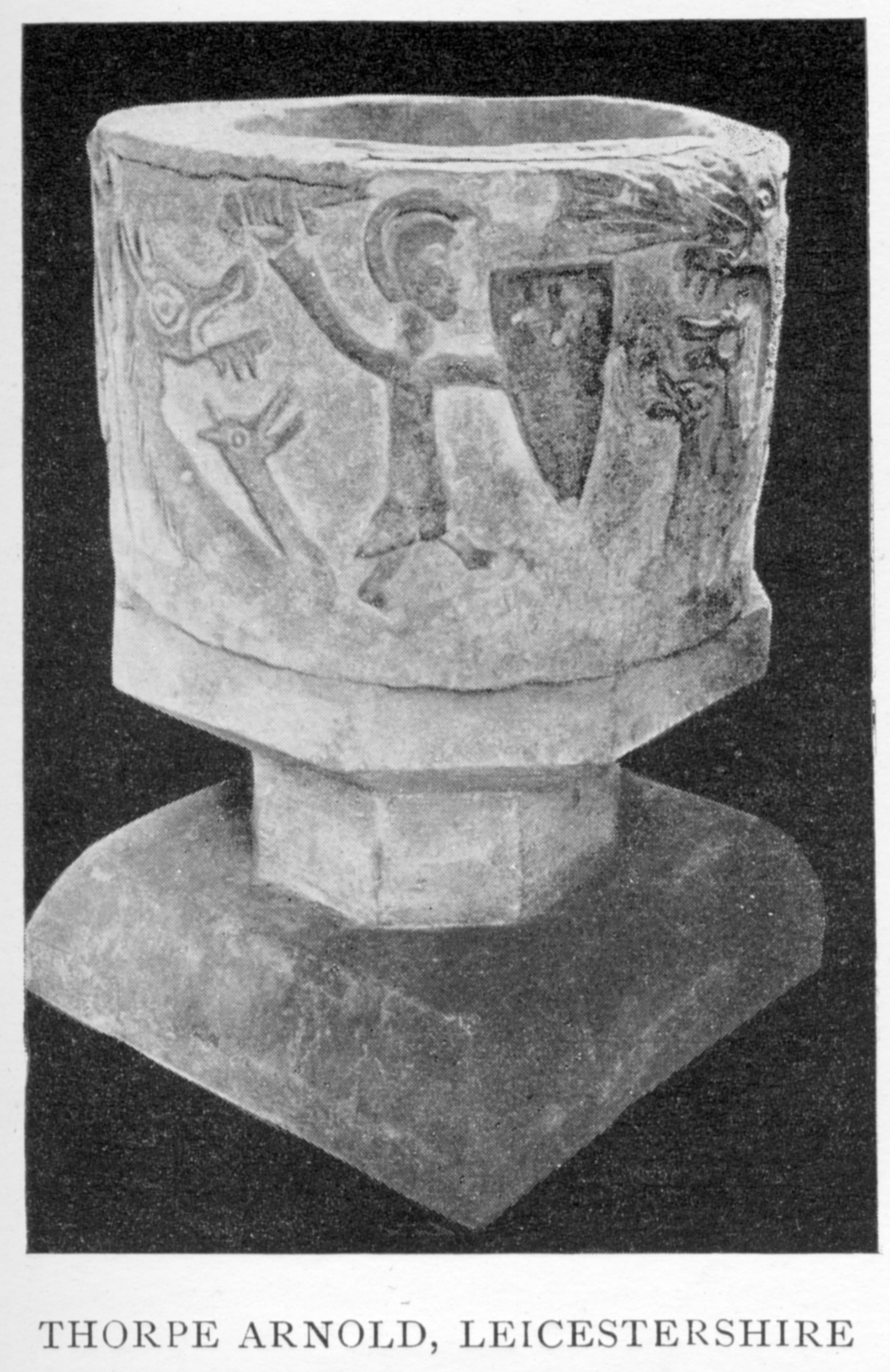
 This Norman era font, from Great Kimble, Buckinghamshire, is of the chalice shape. Salamanders are among the organic-shaped carvings that decorate it. [Photo by Guy Le Blanc Smith, Cox and Harvey facing page 196.] [Download a 812 KB JPG of this image.] 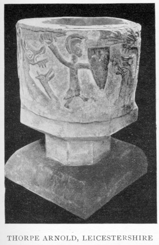 A number of old fonts bear images of salamanders and dragons, including this Norman era font from Thorpe Arnold in Leicestershire which depicts St. Michael dueling with a dragon. [Photo by Guy Le Blanc Smith, Cox and Harvey facing page 194.] [Download a 890 KB JPG of this image.] |
|
|
"The early fonts may be divided
into
two types. In the East they were generally small square or
circular
basons, but occasionally elongated on four sides, and so make the shape
of a Greek cross. In the West [Europe] they are for the most part
octagonal or
circular, forming a wide shallow bason. Their normal depth is
under 3
feet ; in some cases the utmost capacity of the bason was only 15
inches."
"In
England the use of a baptistry separate from the church never
prevailed. In Cornwall there are a few interesting instances
still
extant of Holy Springs, possibly used as baptistries, and protected by
chapels ; and the same are to be found in Monmouthshire as well
as in
Wales. But the almost invariable rule in these islands [in the
British
Isles] seems to have been to place a font in the body of the church ;
in all events this custom was universal amongst us in post-Conquest
[after the Norman conquest in 1066] days." "The
font itself was as a rule [made] of stone, and it was usually lined
with lead [even the wooden ones], save [except] in some of those
instances where an [a water] imprevious stone, such as granite or
Purbeck
marble, was used. Wooden fonts were occasionally in use in those
early
days, but they were always considered irregular, and in later times
uncanonical [unofficial]." Of wooden
fonts, Cox
and Harvey say that in 1297, the West Lee church in Essex had a wooden
font. A font carved from a single, solid block of wood was used at
Efenechytd in Denbigh. Fonts could
also be
made of cast metal, such as bronze, or gilt [given a thin outer
layering] with silver. Precious metals were rare, though. Of the
metal
cast fonts, most were made of lead. |
||
| |
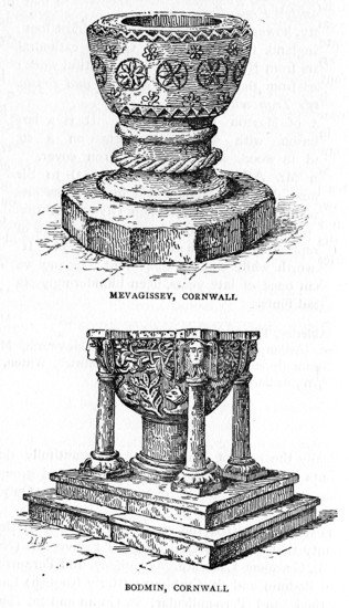 According to Cox and Harvey, in Cornwall many Norman era fonts were preserved. A number depict dragons and salamanders, and at Tintagel, serpents entwine the pedestal shaft under carved crosses. Granite and Caen stone are at times used, but in the northeast of the county, three types of stone predominate in font construction: Catacleuse, Tintagel green-stone, and Polyphant (from the moors near Bodmin). [Illustrations by J. Charles Wall. Cox and Harvey, page 190] [Download a 1536KB JPG of this image.] |
|
|
"Fonts
were ordered to have covers and to be kept locked for the double
purpose of cleanliness and for checking the use of the water for
superstitious purposes. The Bishop of Exeter, in 1287, ordered
that
each parish church was to be furnished with a baptisterium lapideum bene seratum
[a cover]. Archbishop Winchelsea, in his visitation of 1305,
inquired whether there was a fontem
cum secura
[lock]. A provincial English Synod, held in 1236, provided that
the
water was to be changed every seven days. The rubric of the first
English Prayer-book provided for the change being made once every month
; the Scottish book, of 1604, ordered the fort-nightly renewal of the
water..." "paintings of the baptism, temptation and fasting of our Lord, with the inscription—Voce Pater, Natus Corpore, Flamen Ave—that is, 'The Father (revealed) by the voice, the Son by the body, the Spirit by the bird.'" |
||
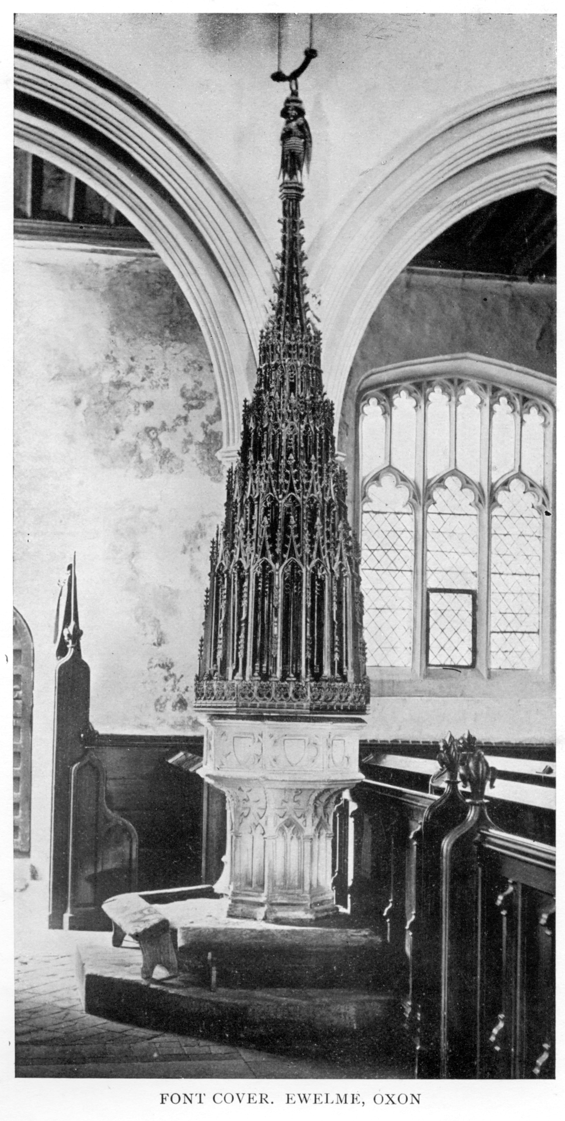
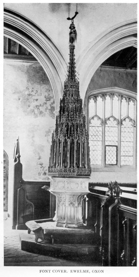 The necessity of a font cover provided the opportunity to create something breathtakingly elaborate. While simplicity can be beautiful, the care and intricate detail on many font covers (which were raised and lowered by a pulley and hung from the ceiling) was to draw attention to the significance of the holy sacrament of baptism. I would guess that this octagonal font from Ewelme, Oxon, was designed sometime after the reformation, perhaps during the 18th century. A kneeling bench is visible on the font step. [Photo by H. W. Taunt, Oxford. Cox and Harvey, frontispiece.] [Download a 1400KB JPG of this image.] |
||
| On
Ornamentation: Prior to the reformation, a style of font ornamentation became common, and that was to depict the seven sacraments of the medieval Catholic church. Fonts at the time were generally octagonal, so each of these sides featured an image of the sacrament, with the eighth side often carved either with the image of the penitent donor, other a depiction of Christ's crucifixion. These fonts could also be elaborately painted in bright colors. Other subjects also could be depicted, including images of the four apostles, Christ's baptism, the Last Judgment, the martydom of a saint, Communion, Mary and child, the Trinity, and "Our Lord in Glory (page 169)." Other fonts could feature heraldry, with carvings of the heraldic arms of important local patrons, especially in the 13th and 14th centuries. For instance, the arms of Archbishop Arundel, who lived from 1397 to 1414, are carved on the font in Sittingbourne, Kent. Some fonts had protruding edges or carvings, such as a rams head. These may have had some practical purpose, perhaps to support the head of the person being baptized. Other fonts had kneeling benches made of wood or stone. Inscriptions: Donors and craftsmen hoped their gift of a church font would solicit the prayers of those who passed it by or used it. Prayers for the dead were common, as prayers were thought to limit the time a soul would suffer in purgatory before they could enter heaven. Cox and Harvey give a number of inscriptions demonstrating this, including these two, following. The first is written on a font from Goodmanham, Yorkshire. The construction date is contemporary to the reign of Henry VIII, and each line appeared on one side of a total of eight (an octagonal font) panels: "Wyht owt [doubte a]ll [sic] may
be saved
Of yor charete pra for them yt yis font mayd. Robert clevying pson. Robert Appilton. Ave maria gra plena dns tecu bndicta tu in mu. lade help. Ihs." (from page 181) Translation (mine):
Without a doubt all may be saved be charitable and pray for those who made this font Robert (perhaps the name of his trade?) Robert Appilton An abbreviated line from the prayer 'Ave Maria' Lady Mary help. The second inscription is from a 13th century font at Keysoe, Beds., in Norman-French (from page 182): Trestui
ke par hici passerui
Pur le alme Warel prieu Ke Deu par sa grace Verrey merci li face. Am. Translated by Cox and Harvey as: "(Pause, whoever passes by this spot, and pray for the soul of Warel, that God by His grace may grant him true mercy. Amen.)" |
||
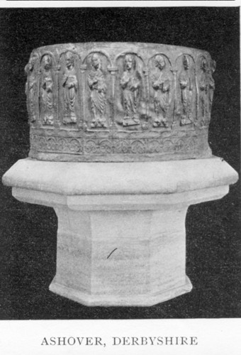 This metal font, of lead, from Ashover, Derbyshire, is a prime example of late Norman craftsmanship. [Photo by Guy Le Blanc Smith, Cox and Harvey facing page 194.] [Download a 910KB JPG of this image.] 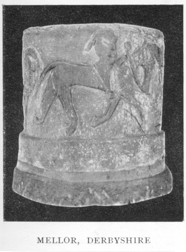 Cox
and Harvey classify this font from Mellor, Derbyshire, as Norman and
date it to the 11th century. The authors refer to the image as a
"hunting" scene.
[Photo by Guy Le Blanc Smith, Cox and Harvey facing page 194.] [Download a 915KB JPG of this image.] |
||
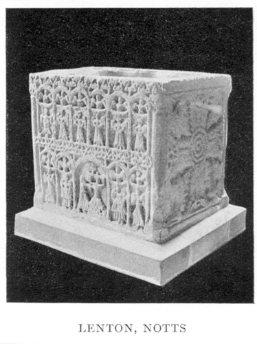
The Lenton Font: This "literally incomparable" font from Lenton, Nottinghamshire (pictured below) is best described by Cox and Harvey, from pages 212-3: "The cubical Norman font of
Lenton measures 2 feet 10 inches by 2 feet
6 inches, and stands (exclusive of its modern pedestal) 2 feet 6 inches
high. The interior of the bowl, which is hollowed in quatrefoil
shape,
is 18 inches deep, and the top is ornamented with foliage, after the
fashion of those in the west of England of Belgian marble.... On
one
of the narrower sides is the Crucifixion, the arms of the large cross
foliated. The scene is most curiously represented. There are
censing
[incense carrying] angels at the upper corners, and the Manus Dei appears on the cross
just above the head of our Lord
[Christ], who is
represented with a cruciform nimbus [cross shaped aura around his
head]. The
two
thieves [crucified on either side of Christ] are shown on much smaller
crosses ;
the soul of the good thief (a tiny little human figure) is shown going
up to heaven, whilst the soul of the evil one is plunging into hell,
represented as usual by the open mouth of a ravenous serpent. The
opposite side of the font simply bears a large foliated cross.
One of
the two longer sides is divided into four compartments by another
cross. The two upper compartments represent the raising of
Lazarus
[from the dead] after a realistic fashion [in a realistic way] ; the
details and the grouping of so many figures in a small space are most
ingeniously worked. Lazarus is lying down in a stone coffin
swathed in
grave clothes ; at each end is an attendant raising the lid ; above is
our Lord (with cross nimbus), having His right hand raised in
benediction and holding a book in the left ; whilst Martha and Mary
stand close to the Saviour. The scene in the other compartment
seems
to be the wonder of the multitude when they see Lazarus coming to
life. Below is depicted the Three Maries at the Sepulchre.
The front
side of the font, which is the most remarkable, is divided by arcade
work into eleven compartments, six in the upper row and five in the
lower. In the centre of the lower line, two of the arcades are
thrown
into one to give greater space, and here is the representation of the
Baptism of our Lord. Christ is shown standing in the water up to
the
middle with hands uplifted in prayer, the Manus Dei appears from the
clouds, and [John] the Baptist places his hand round His waist.
The other compartments on this side are all filled with adoring angels
and demi-angels."
|
||
 See notes on this font, above. [Photo by Guy Le Blanc Smith, Cox and Harvey facing page 194.] [Download a 123KB JPG of this image.] |
||
An interesting story and inscription shows up on page 185, and though the story doesn't concern a medieval font, it's worth mentioning anyway: "The quaintest English font inscription--probably the quaintest in all Christendom—is the one to be seen at Tollesbury, Essex, an interesting church retaining much pre-Norman work. "The small octagonal font, 2 feet in diameter and 3 feet high, bears round the margin of the bowl, in very plain lettering— "Good people
all I pray take care
That in ye
church you doe not sware
As this man
did.
"An entry among the baptisms of the parish register explains the mystery— "'August 30, 1718.—Elizabeth, daughter of Robert and Eliza Wood, being ye first childe whom was baptized in the New Font which was bought out of five pounds paid by John Norman, sen., who some few months before came drunk into ye church and cursed and talked loud in the time of Divine service, to prevent his being prosecuted for which he paid by agreement the above said five pounds. Note that the wise rythmes[sic] on the font were put there by the sole order of Robert Joyce then churchwarden.'" Richenda Fairhurst |
||
<back to top> |
| Historyfish
pages, content, and design copyright (c) Richenda
Fairhurst, 2008 All rights reserved. No commercial permissions are granted. The Historyfish site, as a particular and so unique "expression," is copyright. However, some (most) source material is part of the public domain, and so free of copyright restrictions. Where those sections are not clearly marked, please contact me so I can assist in identifying and separating that material from the Historyfish site as a whole. When using material from this site, please keep author, source, and copyright permissions with the article. Historyfish intends to generate discussion through shared information and does not claim to provide, in any way, formal, legal, or factual advice or information. These pages are opinion only. Opinions shared on historyfish are not necessarily the opinions of historyfish editors, staff, owners or administrators. Always consult proper authorities with questions pertaining to copyrights, property rights, and intellectual property rights. It is my intent to follow copyright law (however impossibly convoluted that may be). Please contact me should any material included here be copyright protected and posted in error. I will remove it from the site. Thank you. |